With a number of corporations shifting towards digital marketing and branding, the world of digital design is witnessing some very interesting rapidly emerging and reoccurring trends. Over the course of the last decade alone we have seen the web industry leave behind the static website fads to come onto the responsive and minimalist oriented design trends. Each of these so called fads has a history but it is important to consider them when you are making your own website for your business. It’s not important of course that your interaction with design trends set up your work for you but they do give you an indication on what you should be experimenting with when it comes to design. Here are seven digital trends that are….. trending!
Custom Typography
Originally, web type-kits that allowed the usage of 'ooh so beautiful' fonts were either too costly to fit within limited budgets or were incompatible with web browsers at that time. Fortunately, things have changed - type-kits have become affordable (or free in the case of Google Fonts) and web browsers have come of age with better functionality and compatibility. Custom typography is hence emerging as a hot digital design trend as a lot of digital brands consider it as a vital aspect of their digital branding strategy and yet another tool to make 'pretty' websites.
Simple and Flat Designs
With the boom in PSD to HTML conversions for web design, web design is only limited by one’s own imagination. Contrary to this, simple and flat designs are still rocking! Simple and flat designs tend to use fewer colors, textures, gradient and shapes – nothing too fancy, just simple. And probably the main reason behind this digital fad is the ease with which flat and simple designs can be translated into responsive sites - you can’t have a website looking too different on two different screen sizes can you?
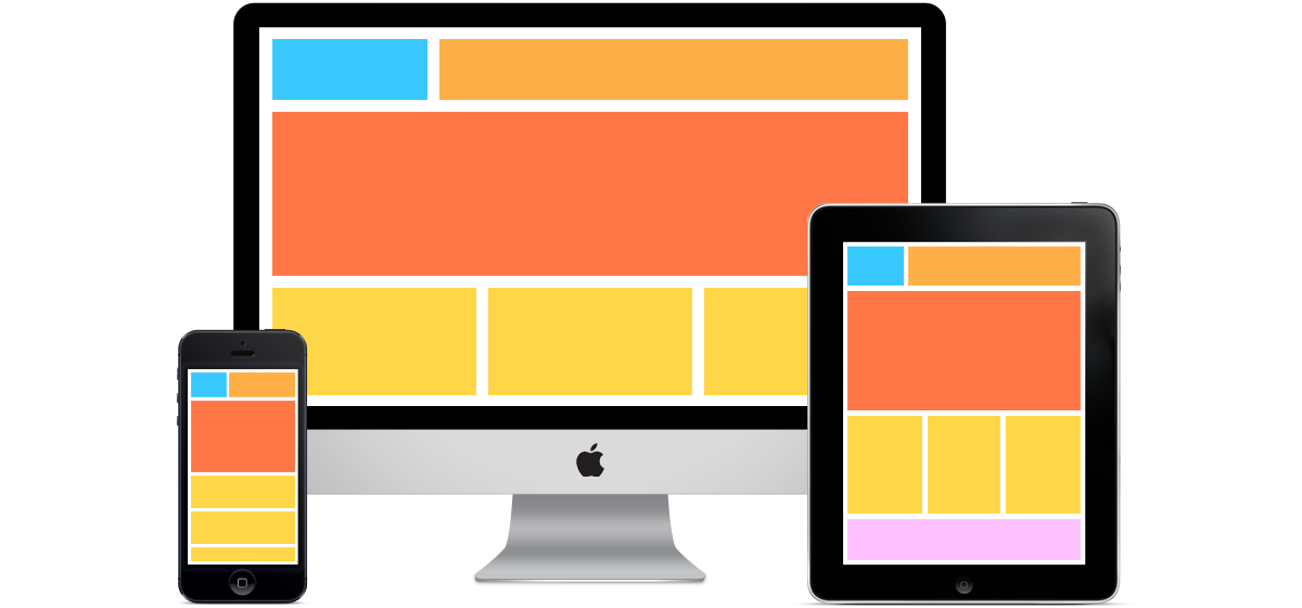
Responsive Design
Responsive designs have become more of a necessity rather than a trend given the increase in the number of internet compatible devices. Originally it was just desktops and laptops, but now people connect with the internet via smartphones, tablets, pads, televisions and what can quite literally be summed up as a plethora of screens of all shapes and sizes. Responsive designs enable a website to scale and change accordingly without creating multiple, separate sites for each individual device.
Scrolling Over Clicking
Websites based on a single page layout – or to put it more aptly – which involve more ‘scrolling down’ as opposed to clicking, or tapping, are gaining much popularity owing to the fact that web design is indeed skewing towards a more enjoyable mobile experience. The number of people who connect with the internet via mobile devices is increasing and making mobile websites more user-friendly is imperative to keep users engaged. , It also cuts down on loading delays and allows for a more dynamic interaction to take place between the user and the website. And let’s admit; scrolling is more intuitive than clicking or tapping… and it’s easier to do!
Larger Design Elements
With web designers focusing on simple layouts and more content, three’s a lot less clutter and more space to play around with. The usage of large design elements such as fonts, images, videos and illustrations in web design is thus trending. This helps designers utilize screen real estate on large displays, and increase usability on smaller ones.
Scalable Vector Graphics
Now unless you view a website’s source code, this is something that might be hard to spot – but is definitely worth mentioning. The) usage of
scalable vector graphics (SVG) is a rapidly growing trend in web design as it allows developers to address the concern of web scalability much like the demand for responsive designs. However unlike
responsive design, scaling images can be much more difficult. Designers need images that are large enough to look good on bigger displays without compromising load times for a mobile device. Vector images offer a much needed solution as they are small in size and can scale without any decrease in quality.
Microinteractions
Every time you change a setting, sync your device, set an alarm, pick a password, set a status message, retweet something, you’re engaging with a microinteraction. Microinteractions are contained experiences or moments within a product (or perhaps a module on a website) that revolve around a single use case. And they’ve become increasingly trendy as they seem to promote user engagement… we all ‘like’ it!
Contributor Bio
Megan Dennis is an Inbound and SEO Strategist for Pac and Copy Plus, a digital marketing agency offering various web related solutions to its clients. Follow @megandennis07 for more updates.Labels: Articles, Branding, Design


